
Below are some new pictures produced in the last week.
I shall try to put new work up every week on my home page after attending life classes and some
portrait classes.
The pictures may not always be successful, but I hope to explain my thinking
 I'm just back from a brilliant painting course with Andrew James. He's a great artist and a lovely man. I feel that I've learnt alot and I now have a much clearer idea my approach to painting...I'll still go wrong...I'll just have a clearer idea why!
Below are some of the oil painting sketches that I did while on the portraiture 'masterclass'.


 Joe reading. I'm off this week to pick up new ideas from a fabulous artist called Andrew James. Hopefully his course will push me out of painting too cautiously and conventially. This painting of Joe is again too 'tight' for my liking, although I do quite like his sensitive little face and the bold design created by the t-shirt pattern.
 Lucy, standing in the sunshine. This painting is not really loose enough, but I enjoyed introducing cadmium yellow into the sunlight...its a colour that I'm normally afraid to use in skin tones.
 Second painting of Geoff, painted from life at portrait class on 12th April. I like this painting better than the last because the painting is more 'broken up' into smaller patches of tone and colour.
 Stripey t-shirt. I thought this made quite a good simple design.( cute baby is an added bonus!)
 8th April. This is not the best painting of Amy, but I couldn't resist painting that baby mouth and button nose.
 30th March. I really struggled to capture the feel of the models cheek resting on her shoulder, but by the third picture its beginning to work.
 In the finished painting of Angela I kept the chest area blurred out in order to keep the 'L' shaped design created by her head and shoulders.
  Geoffrey, retired school teacher. I was trying to make a bold design in this painting from life.
 Amy...I've gone mad with the pink background...but I like it because it contrasts with the cool lights in her hair and face.
 23rd March. At my portrait class I've spent the last 2 weeks painting a lovely lady dressed all in black. I painted her portrait first, then her seated figure. I always struggle with composition in painting a whole figure (nearly whole), but I liked the simple shapes in this picture.
 Out of recent paintings done at my portrait class, this is by far my favourite. I think its because its quirky and full of character.
 A loose sketchy painting of Amy in her bib. I was using just 3 colours, cadmium deep red, ultramarine blue and yellow ochre. Ilike the effect of a limmited palette, but I think I need to experiment with some different groups of three.
 10th March..another painting of Amy.
 Tues 6th March. I did this painting of Helen in only 2 hrs so its not really finished but I've put it on the website because I was trying something new. I'm trying to establish my portrait in mostly 2 tones ( medium-dark and very light). I painted the darker tones in mixtures of Red, blue and yellow ochre. The idea is to keep a strong sense of drama and design. Its not working yet in this picture...but its an idea that I'll pursue.
 Last weeks life class. A portrait from the front of Robyn the dancer.
 Yet another painting of little Lucy. I've been experimenting recently with working on a white canvas(I used to prefer a coloured surface) The idea is to create more glowing colours...I think it works well in this picture.
 Mike, painted 22nd feb. He looks like a character straight out of a Dickens novel. He came dressed in his finery, as the mace bearer for the mayor of Monmouth.
 14th feb life class. The model is an ex ballet dancer and has the most amazingly long and graceful neck. I was trying to do a sensitive yet bold and striking picture.
 Paula, painted at the portrait class. She naturally tilted her head back, and appeared to be lit from below. I quite liked the softness of the painting but it lacks a bold statement.
 Last Tuesdays life class. I'm not entirely happy with the flesh tones, but I did enjoy using lost and found edges.
  This is the first of two paintings that I did at the thursday portrait class. This one is very small scale, only 6ins by 8ins. The idea was to keep my pictures more simple by reducing the scale, and thereby make them more powerful and painterly. Recently I've gone into so much detail that I've lost the essence of the pictures.
 This is the second painting of Johnny, its a much better likeness and more detailed. Its about14ins by 18ins.
I liked the colours in this painting of Lucy. There are very cool colours in the skin as if she's lit by cool lights from the window. I never usually paint Lucy without her glasses, but this time they obscured her eyes too much so I removed them.
 This was a surprisingly tricky pose to get right.
 6th feb, This is last Tuesday's life class painting. I'm not entirely happy with the finished painting. I'll probably scrap it...
 I was playing around with colour in this portrait of Lucy. I left alot of blue in her face to contrast with the warm orangey shadows (they're more muted colours in the shadows of the real painting). I've also got strong reds to contrast with the greens.
 Last Thursday we were lucky enough to paint the Mayor of Monmouth in all his finery. He normally has a smiley face but when bored his faced dropped into a moody pout that was wonderful to paint. I think the face shows up better in the photo below.
 I think this photo shows a clearer picture of the face, left click to enlarge photos.
 Amy in her best dress
 24th Jan. I discovered that stripes are great!
 The finished painting of Michelle. She fell asleep during this pose and it was lovely to see her so relaxed and comfortable, as last weeks pose was really painful for her.
 19th Jan. Portrait classes have started again too. This painting of Lolly really needs more work,but I loved painting this lovely slender (almost fragile) mature lady in her blue hat.
 17th Jan. Life classes have started again...brilliant! Our first model was Michelle, a large,strong looking woman. I loved drawing and painting the feeling of weight and power in her body, yet there was some vulnerability too. In every person there's a kind of beauty.
 In this 10 minute charcoal sketch, I covered all the paper in a rubbed in layer of charcoal, then 'lifted' the highlights with an eraser and drew in the darkest tones.
 I have the photos showing the progress of my oiln painting of Michelle, but I don't have the finished picture as, (luckily for me) the model wanted to keep it. I approached the painting in a very loose way by sketching in large areas of warm or cool colours, then I tightened the drawing up later. It feels a bit dangerous working like this as everything is chaotic for a while, but I'm hoping to produce a more painterly style.
 16th Jan. Lucy again, with a slightly defiant look this time. Lucy's a real 'tomboy' with a strong character and a great passion for Robin Hood and all things adventurous.
 8th Jan. Another painting of Lucy...this one gave me an opportunity to play around with rich colours. I'll try to use a wider range of rich colours once art classes start again in another week or two. Its very frustrating having no 'live' models ( I can't get my husband to sit still long enough!)
 5th Jan, Owen
 1st Jan 2012. I liked the loose brush strokes and painterly style in this portrait of Amy. I've been looking at demos by Zimou Tan (on youtube) and I love his approach. I'm determined to be less illustrative and more painterly this year...hmm.. if only it was that easy.
 I liked the chubby hands in this one.
 'Monkey Puzzle'.I like the shape made by the light areas of Amy with her picture book.
 24th December.Lucy, with sunlight all around.
 Angela. A hungarian girl with quite striking slavic features. The painting was difficult to photograph as it's very shiny.
 No art classes right now so I'm back to painting grandchildren...I never tire of it. These two pictures of Amy are, unusually for me, painted on white canvases. I usually begin on a surface already covered in loose paint marks. I must admit that it makes some colours glow, but I miss the feel of a picture emerging out of chaos.
 just enjoying the sunshine in this scribbly hair.
 6th December. I went for the portrait again at my tuesday life class because Gladys has such a strong and sculptural face.
After the life class, I played around with my painting of Gladys alot. I wanted to up the contrast and bring out warm highlights on her cheeks and forehead.
 Here I'm trying to explore a dark and subtle painting, I like the way her right arm fades into shadow...I may yet go back and darken more of her left arm and the pattern on her dress.
 My second painting of Dick. The likeness is not so good, but I think the painting's more interesting.
 7th december 2011. Trying out a profile. I was quite pleased with this one of Joe, aged 4.
 Last thursday's portrait class. The sitter was a gentleman called Dick. He had just the hint of a smile playing around his mouth and a twinkle in his eye, a lovely man.
I've been playing around with shades of grey recently...it can lead to some beautifully sensitive pictures. (If you left click on this one it shows off the colours a little better)
 The build up uf Jamie..week 2
 The finished painting...its ended up very different from last weeks picture (to see just scroll down). I like the strength in his face, and the play of colours.
  This is my second try at painting Louisa. This time I wanted more of the un finished, scribbled look. ..to keep it lively. ( Also, we only have 3 or 4 hours)
 Tuesdays life class. I wanted to do a portrait emerging from a dark background.
 The finished Jamie.
 Louise, painted at thursdays portrait class. I've been researching work by John Singer Sargeant this week...and wanted to paint in his style, with a strong sense of simple design.
 I've altered this painting of Amy that I did a few weeks ago. I think its better...maybe..hmmm.
 10th Nov. Tony. I'm tring to keep the portrait loose and painterly, but at the same time I want to almost 'sculpt' the features to make them seem 3D.
 Tuesday,8th Nov. Building up a portrait of Penny.
  A close up of the finished painting of Penny. I'm afraid there's alot of shine on this picture.
 9th Nov, had a go at a triptych. It's tricky doing three paintings in one...I tried to get the lighting and colour scheme all the same.
 Tuesday life class. I decided to go for a portrait.
 2nd Nov, the finished portrait of Penny. She has lovely strong features, and I think I captured a good likeness.
 I've tried a more scribbly approach to this painting...and I quite like it.
 31st october. In the swing again.
  This is yet another painting of Amy in the hat. I was really just enjoying playing around with the colours and reflected lights in this series of pictures.
 Angela, painted at my tuesday life class. I usually try to 'lose' parts of a figure into the background, to keep it soft, but in this case I liked the strong lines...so I kept them.
 22nd October. here are 3 of my latest charcoal sketches drawn at the 'extreme poses' class in Stroud.

 16th October.This is the progression of my painting in last Tuesdays life class. I did alot of scribbling in the background to give me ideas for how to treat the background, and to tie it into the figure. In the end I made the background much more simple.
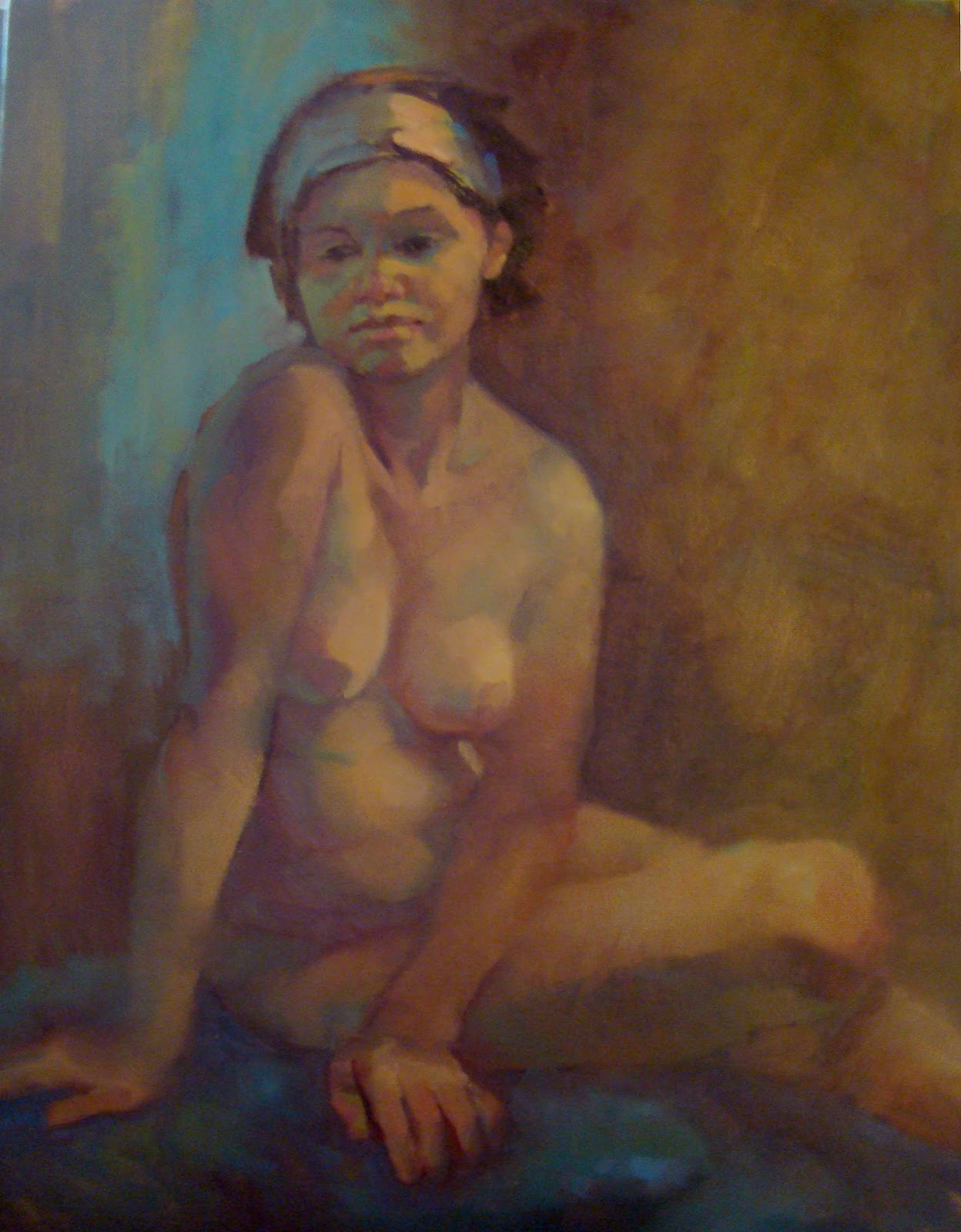 The finished painting of Angela.
 When I'm not drawing or painting from life, I go back to painting from photos of my lovely grandchildren...This one's called 'Jam on Toast'.
 Below are my 4 most recent charcoal sketches. I think this one is my favourite. I was going for a dark and expressionist approach.
 I lked the soft face in this sketch
 In this sketch I was trying to make strong contrasts on the legs, then allow the charcoal to be softer further up as the head was futher away.
 Below are four charcoal sketches done in two lfe classes over the last week. This sketch took 10 minutes and I was trying to suggest a hazy figure in a dark room. I rather like understated artwork..and I generally get too fussy.
 Model in a slightly uncomfotable pose.
 This is a very carefully painted oil painting of Lucy on a hessian canvas. Strangely enough, its much easier to paint accurately and tightly, than to paint more loosely in the impressionist style, as seen in some of the paintings below. There is some dispute in my household as to which is the better approach. If you have any opinions you're very welcome to e-mail me at lowekathy54@gmail.com
 5th October. Amy in a swing...I'm not sure if it's finished yet.
 I tried to capture the effects of sunlight in this painting of Amy.
 27th September Natalie was our model at todays life class. I painted her portrait from this unusual angle...and tried to use some vigorous brush strokes to add liveliness and to describe the direction of the planes in her body and the chair.
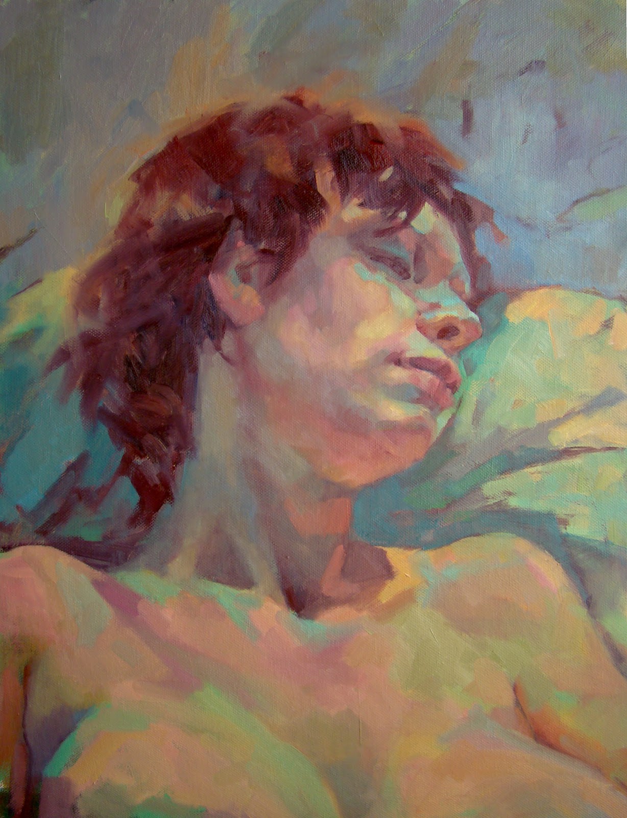 The finished painting of Natalie. I was quite pleased with the way the light and shaded areas were broken up into little chunks of colour. Also, I altered her far cheek after the art class to show reflected lights on that cheek, which blend into the colour of the pillow she's resting on.
This is an altered painting of Amy that I did a few weeks ago, but I didn't like the arms...so I've removed them.
 This is another painting of Amy in a bonnet that I'm experimenting with. I quite like that unfinished look...but this really is unfinished. I need dabs of cool reflected light under her chin (cool yellows perhaps) and just a suggestion of the blouse.
I've added a few bits to the painting now, and I think its finished. I like the lively brush strokes used to describe the foliage behind.

I had another go at painting my favourite photo...first done 4 or 5 years ago. Its interesting for me to see how much I've changed in that time. I think my style is softer now and colours richer...but I still like the first painting best.
 A painting of Amy, in which I try to capture the cool light coming from the windows behind.
 20th September. Hurrah, life classes have started again. Our first model was a young woman,7mths pregnant. I was at first struck by the very cool shadows and so, of course over exagerated them. Next I struggled for a while with proportion as the head seemed too big, but I balanced that by enlarging the lower body.
 Here's the finished painting. I hoped to capture the image of a young woman loving the feeling of pregnancy, cradling her swelling stomach protectively.
 I did this painting from a photo I took in the Dordogne. I had to abandon my original painting, done in situ due to a car planting itself right in front of the steps! Don't you hate it when that happens.
 Below are a few of the landscapes that I painted in the Dordogne in France. I'm not really a landscape painter, but I was most pleased with this picture that is largely sky, because it allowed me to paint loosely.
 The hill top village of Turenne.
 View from the verandah at the house in Astaillac.
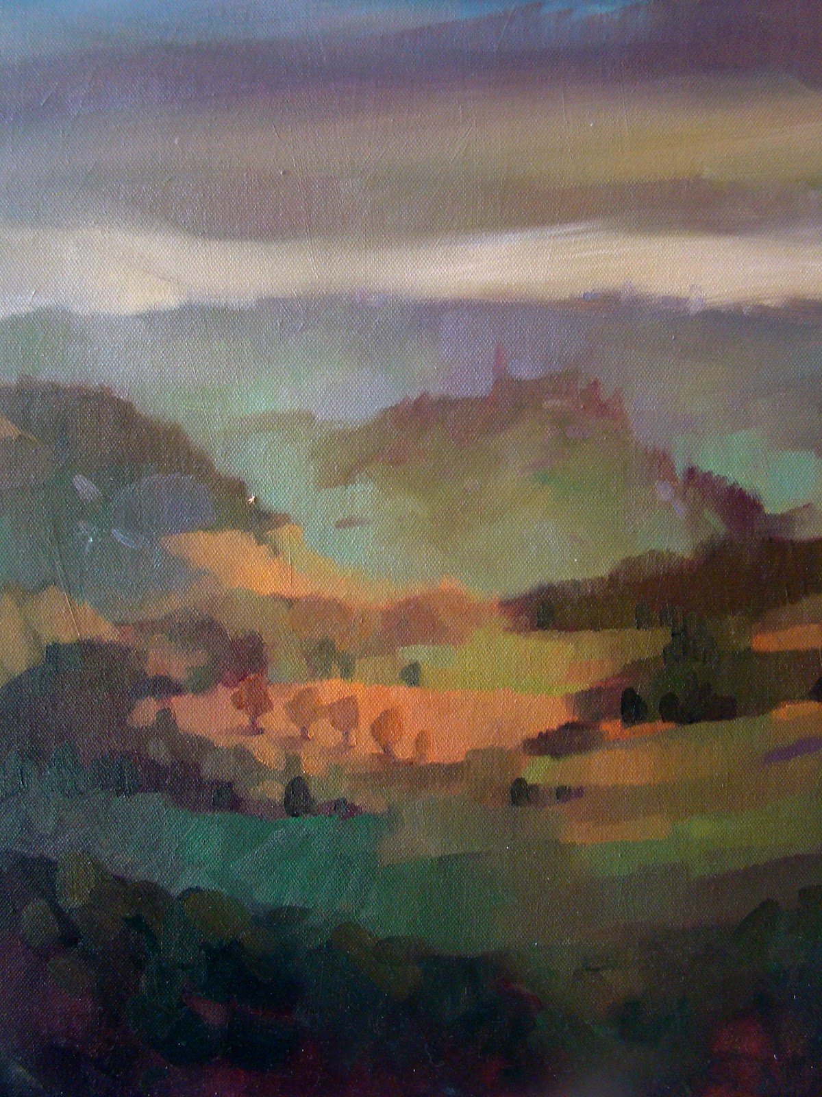 This is the first painting I did in the Dordogne. There was just a hint of a castle on a distant hill.
 5th September. Penny, in charcoal
 I was more adventurous with colour in this painting of Amy, and I like the overall effect of splashes of blue.
 1st September. I wanted to paint Amy with strong shadows across the face. The picture would probably be better without the hands and arms....I may paint them out as I'm not happy with them.
 20th August. My most recent piece of artwork is this clay model head of Penny. I really enjoyed getting back into sculpture...but I shall go back to painting soon. I miss the colour!
 This is a clay model that I made many years ago...(the model doesn't look very comfortable!)
 10th August. Marigolds and cornflowers. This is another attempt to paint flowers. I wanted a loose and impressionistic effect (which is surprisingly difficult to achieve)
  I dug out an old photo of Gladys this week and painted her lovely face...just for the sheer joy of it. Its such a sculptural form.
Another lovely face
 5th August. Another grampa picture. Old faces are so interesting.
 31st July. This is the first watercolour portrait that I've done in about 20 years. It was fun sploshing colours around, and dribbling (the paints, not me).
 28th July. My attempt to do a landscape...I'm going for one tree at a time.
 27th July. A bit of a scary self portrait!
 This is my attempt to paint flowers loosely an with a big brush. Why is it so hard to paint flowers? I'd rather do a portrait anyday!
 I painted this portrait of Joe quite thinly on a canvas board.
 19th July. Another Joe. I think the photo is showing alot of shine behind Joe's shoulder.I shouldn't really photograph paintings when they're still wet! I'll try and put a better picture up soon
 Due to there being no art classes, and out of sheer desperation, I did a self portrait. I know I look a bit rough, but its not meant to be flattering.
 14th July. A few more sketches from my extreme poses class. Sadly classes stop for the summer...but next week I'm going to try landscapes. I really am hopeless at landscapes...but you've gotta try!
 Crouching. I like the effect of running the charcoal beyond the edge of the figure
 There was strong underlighting in this pose.
 A quick sketch of the face. He has the most amazing face.
 I've reworked this picture of Joe to produce a looser image. I'm finally taking controling my pictures to make them as loose or tight as I want. At last I'm in charge!!
Yet another picture that I've reworked. I rather like playing around with images to find different ways to paint them.

 This is another painting that I've had a second go at. I liked the expression.
  7th July. Thursday life class. Its the man with the mohecan again.
 I reworked an old painting that I did of my Dad. I used to do very 'tight' paintings...so I went over this one and loosened it up a bit. I prefer it now...it just needs a little bit more tweaking...
 30th June. Extreme poses class.
 Man with a mohican. This was done on a very rough paper...I didn't like it! Back to gessoed paper I think.
 Trying the scribbly approach. Left hand looks like its unscrewing a bottle top!
 I'm just playing around with a little old black and white photo that I found of this old gentleman. The picture's not quite finished, but I've enjoyed having complete control of the colour scheme.
 23rd June. Extreme poses class. I'm playing with textures here by using charcoal on paper covered in a layer of gesso. The model is about 6mths pregnant.
 I thought I'd try rubbing charcoal all over the paper and then working into this surface with charcoal and a putty rubber. The texture of the surface is amazing because charcoal fills the grooves left by the layer of gesso.
  Here the models look as if they're floating (I'm not too sure that I like this effect...)
 22nd June. Here I've reworked an old painting of my Dad. It was done from a photo taken a few months before he died. I think that the pose, the colours and the style help to show his vulnerability.(Well, thats what I was aiming for!)
 When there are no classes I always fall back on working from family photos. It allows me to play around with colours and techniques, in this case I was using very cool flesh tones against a rich dark background.
 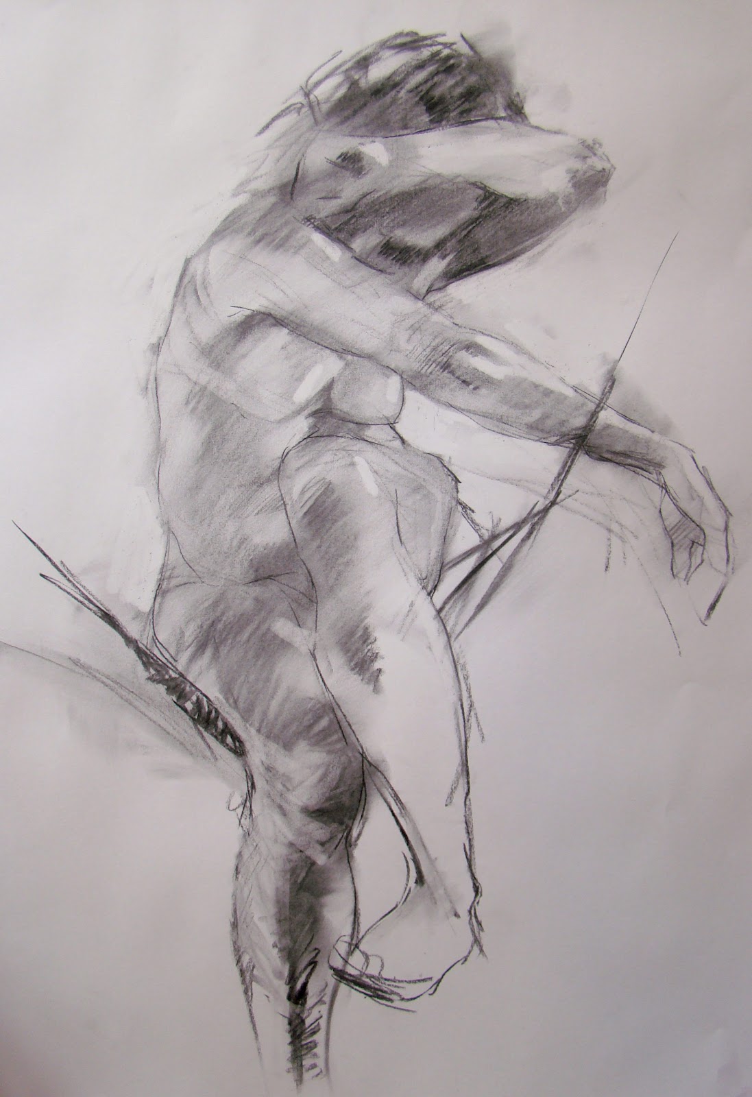 16th June. I went to a new art class today, called 'extreme poses'. The model rested in a sort of web of stretchy ropes, so that a variety of unusual and dynamic poses were possible. I liked this one because the pose seems to suggest vulnerability.
 In this charcoal sketch I tried to keep the darks stronger and more lively
 7th June. Penny - quick pose.
 I tried to 'break up ' the light and broad areas of colour in this painting to give a more atmospheric effect. Must try to extend this idea next week.
 Amy, 11months. I loved painting this picture of Amy, she has such a tender face, especially after tears. I left the tear drops out as they would have been way too sentimental.
31st May
 Michelle. This is the second week on this pose and I decided to do a portrait only as the turban round the head added such a strong sense of design to the composition. I'm still trying to use the painterly approach that I developed on Ken Paine's course.
Joe
 Michelle, with a turban.
 17th May. Gladys again, but from a different angle.The finished painting is below. I think the loose and lively background works well. It sort of illustrates Gladys's strong and complex character.
 12th May. I loved painting this portrait on Thursday. The young lady had pale skin, wild hair and a brilliant sense of humour.
 Built this painting of Gladys up on a canvas that had been used before...I just scribbled some viridian paint over it to obscure the image below. As usual, I found I rather liked the green showing in the face...but I gradually toned it down.
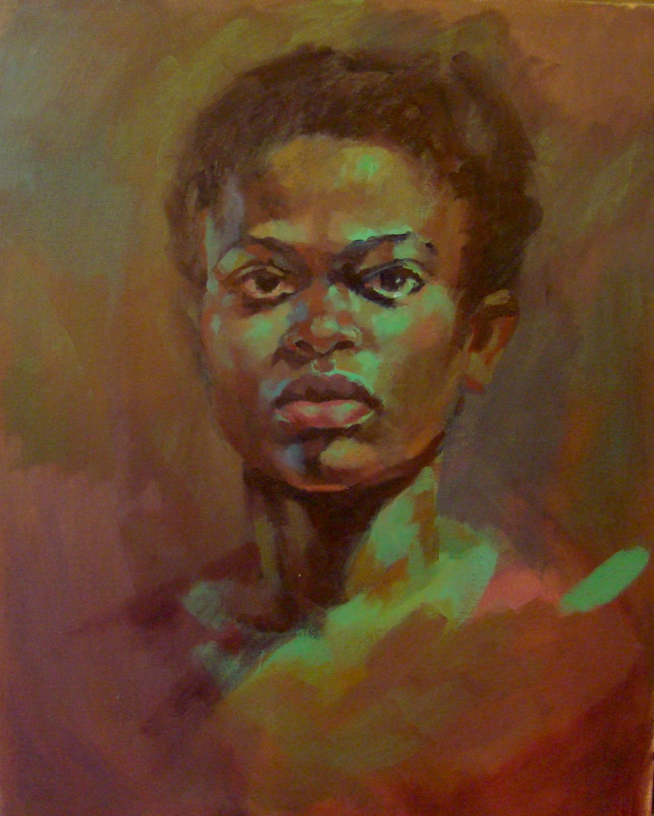
10th May. Gladys. The finished painting.
 Gladys 1. Quick pose...I liked this one as its very 'free'.
I like the broken image that comes from loose brush strokes.This painting still needs a little work, but on the whole I'm pleased with it.
8th May

Lucy aged 6. I love introducing cool greens to flesh tones..the colour is somehow fragile and sensitive.

1st May. This is the finished version of a painting I started a few weeks ago (see below).I was very pleased with the background, but have endlessly messed with the water...don't think it'll ever be right!
 Started a painting of Joe. Rather like the sense of abstract design gained from leaving the body unpainted (its just the colour of the prepainted canvas.)I will of course paint on.
Joe. Sort of finished picture (I'll probably fiddle!)
 3rd May. A 10minute pose. Just time to plot in the darks and medium tones, rub it all out again, then redraw with fine point or charcoal and lift a few lights out using a rubber...phew!
 1st May. Ken Brown in stripey suit. Painted at Thursday portrait class.
 26th April. Life class has resumed! We started with 5 minute sketches...this suits me as I like the quick, spontanious, mimimalistic look.
 Another 5min pose. Just time for simple shapes and tones.
Another painting I've been working on this week. Joe, my 4yr old grandson, had struck a 'cool' pose and I wanted to paint that feeling using the composition and a slightly pouty mouth.
I may well go back to this pic in the next few days because I can see several things I want to alter. (this always happens when I put stuff online!)
 23rd April. I've just started a second attempt to do this painting. This time I'm going for a more broken up, undefined approach. I want to capture a feeling of cool, green light falling across the boy and water suface as if they are one. It's not finished yet as I need greens in the background that don't look heavy and overworked...not sure how to do that!
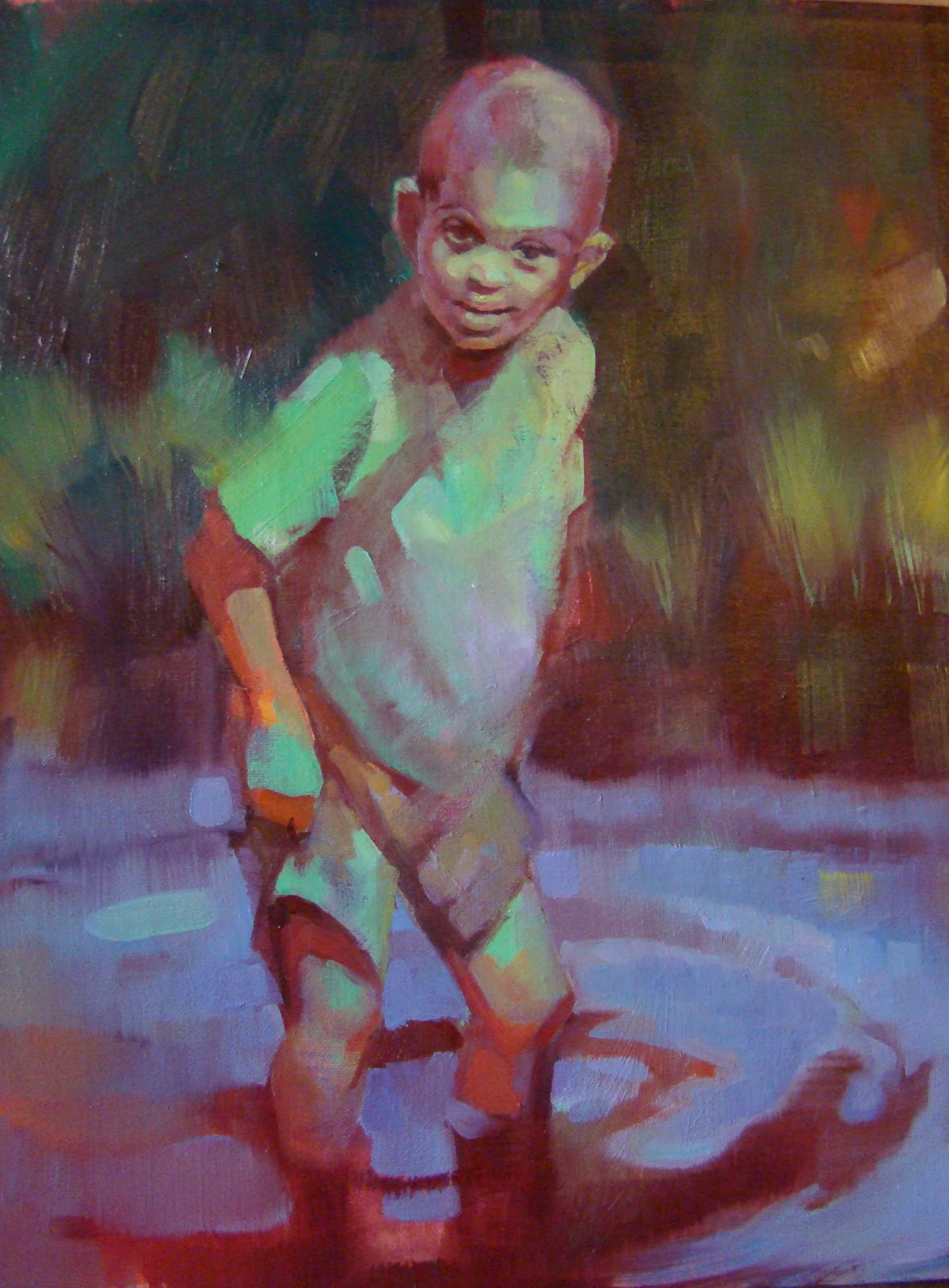 April 16th. This is a close up pic of a painting I finished today. It's from a photo provided by my South African friend, Helen. I love painting children playing, and this gorgeous little boy paddling was an irresistable subject.
 This is another portrait done while on my Ken Paine course. The model was a very beautiful, part malaysian girl. Ken said ,'You've made her too pretty.' It was difficult not to. I liked the big brush strokes in her hair.
 31st March. Ray, painted yesterday...so still a little shiney and wet in places. I'm trying to keep the looser, more fluid style that I picked up on Ken Paine's course.
 Here are a couple of charcoal 10 minute sketches done at Tuesday's life class. I think it's somehow easier to capture the 'feel' of a pose in a quick charcoal sketch, than in a carefully executed painting.
 Ken Paine teaching at Dedham hall, March 2011. Below are some paintings done ( by me) on Ken Paine's portrait course during the last week.
 This was my first painting (partly done). When Ken saw it he announced loudly that I was accurate and accomplished....but much to tight! Time to loosen me up. So he splattered white paint all over the face, to 'mess it up a bit' .! Thanks Ken!
 This is my finished painting...its quite loose, but could still go further
 This is one of the more 'creative' pictures...painted quickly and going for broad shapes. I'm also starting to look for 'character'. This was a lovely , but slightly awkward teenage boy called Alfie.
Abi. She had the most beautiful sculptural mouth.
 Tony, distainful? or just bored....probably the latter.
 Tony again. This time I'm looking for 'shapes'. Ken paine says it's simple...its all just shapes.
 Peter. I was looking for emotion as well as character here. Peter is quite frail and sensitive.
 There's a different mood in this second paiting of Peter. By this time I've learnt alot more about structuring the head strongly using simple plains....and I'm painting loosely, with larger brushes. At last I'm getting somewhere!
 Colin, he looked like a native american.
 Penny. Trying out a cooler range of colours...and the old yellow/violet combination.
 Red/ greens this time. Ken only gave us 20minutes to paint this one!
 My finished painting of young Alfie....I'm not sure if it was better half way through when it was really loose.(see higher up the screen)
That's all the pictures from Ken Paine's course. I feel as if I learnt and changed so much during the past week that I'm tempted to erase many of the paintings below....from now on (all above) it's loose brush strokes and wild abandon!!
 Jamie again
 Tuesday 15th March. Had a second go at painting Jamie. I like the shoulders better in this one....but overall I think that last weeks pic was more powerful. So I may fiddle with this one some more. (Will be busy for the next week as I'm off on a painting course with Ken Paine)
 This is how my Jamie painting developed. I'm not too sure about the dark background. Hmm..
 8th March. Life class. I decided to do a portrait of Jamie because he had such a strong face. Lately, I've started to paint thin dark layers of oil paint to describe form and shadow. I paint initial layers using cadmium red and ultramarine then I try to use the mimimum of brush strokes to add opaque colour in lighter flesh tones. The fabulous greens come from the coloured canvas that I start with. ( I paint most of my canvases with loose , broad strokes of yellow ocher, some magenta and viridian green.)
3rd March p.m. I did this painting on mountboard as I had used up my canvas in the morning session. Putting oil paints onto mountboard is the strangest sensation as it sucks all the oil out of the paint and feels quite dry. Still, I stuck with it, and was quite pleased in the end. As you can see, I'm still slapping viridian all over the place!
 3rd March. Morning painting of Sally. I stopped quite early on with this painting as I felt it had the impressionist style of Augustus John, or his sister Gwen. I didn't want to overdo it.
 This is my morning portrait of Gladys, 1st March. I try to keep paintings loose and 'painterly' as overworking can make it lifeless and dull. I want the finished work to look like a painting, not a photo (no, really!)
 I couldn't resist painting my gorgeous daughter and granddaughter.
 Eirlys. I've shown a close up of this portrait just because Eirlys has such a lovely sensitive face. (You can always see pictures enlarged by double clicking on the image)
 Tuesday 15th Feb. Painted Gladys on a preprepared canvas. I really liked the viridian green on her face and chest...but it had to go on her face as it didn't make sense. I could keep it on the chest as there was a strong cool light coming from the left.
 This is the final version of Gladys. I simplified the lower body so the it would be less distracting.
 I think the painting would have had more impact cropped to this size. I like the play of cool light on and around her head and chest.
 14th. Here are a couple of the results of a weekend spent playing with inks again. I've introduced gold ink into the mix with interesting results.
 Feb 14th. I'm getting a little more control over light and shade in my printing.I don't just want an outline on a crazy background (although I do like the unpredictability of mixing inks on the glass plate that I roll out on)
 8th Feb. Picture in progress. (painted onto a board with viridian and magenta base)
 This is how my painting ended up ,Tuesday 8th Feb. Penny was sitting in the same pose as last week, I just moved round a little because I thought the spokes of the chair could add a pattern to the composition.
 This is my final picture from Tuesday's life class. I decided to lighten the background to define the overall shape of the sideways facing figure.
  I was lucky enough to sketch very striking looking young man on Saturday..He had quite a ferocious stare. I drew using a combination of pencil and charcoal.
 I think charcoal is fast becoming my favourite medium...its so sensitive.
  Backs are surprisingly interesting...I loved using a
variety of marks to describe this strong torso.
 6th Feb. This print has shiny copper ink. Mmmmm
 This one's quite 'jazzy'.
 Been playing with printing inks again!
 I love the early stages of a picture, but this one was quite hard to capture.
Tuesdays Life Class. I worked on this today (Friday 4th Feb), because the whole picture was a bit drab and dark (so much for trying to do dark and mysterious!) I found the painting was much improved by a few light areas in the background....and by moving her right arm up a little.

 Penny, back from trekking in Nepal.
 Feb 1st. These 10 minute charcoal sketches are, I think, often more lively and interesting than the careful 3 hour paintings.
 I painted this portrait on a canvas painted in pale viridian. I sketched in the head with ultramarine and magenta then built up opaque skin colours, including some viridian in the mix. I was pleased from step one because the green and reds played beautifully against each other. (Thanks to John for taking these photos as the picture progressed).
 This is my final portrait of Sue (25th Jan). Its one of my favourite recent portraits, just because I love the colours.
 Tuesdays Art class (25th) Still enjoying charcoal sketches of Sue.
 I'm still working from old sketches, so you may see the same poses coming up, but painted in different mediums.
 The colours come out a bit random, but thats what I like.
 23rd Jan. Still playing with inks, but in a different way.
 I'm afraid this is very like the print two pictures down. I think I like this one better.
 Sue's quite a big girl, but wonderful to draw! 18thJan.
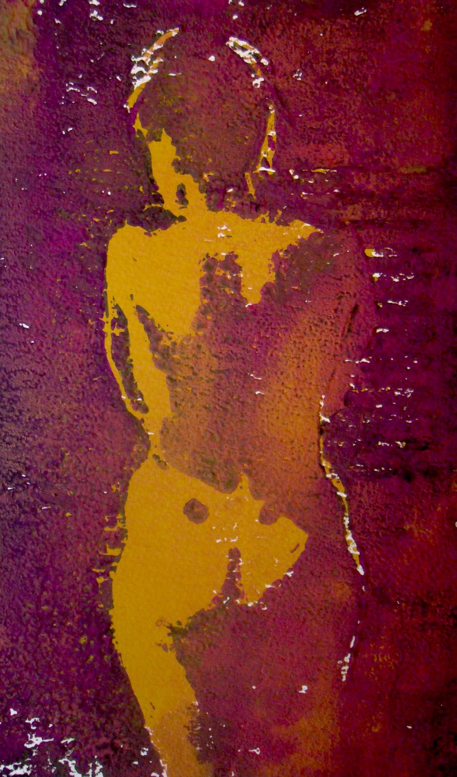 Wow, this printing lark is fun. You never quite know what's going to happen!
 Another attempt. Thinner, smoother paper this time.
 One of my first attempts at lino printing. Its a bit weird but I quite like speckled effect that comes from printing on vary rough watercolour paper.
 This is another painting that I developed from an art class quick sketch. This, and other 'room setting' pictures are inspired by Bernard Dunstan.
 14th Jan. Here's the finished picture...put into room setting (just lightly sketched in). Does this help the picture...I'm not sure. You can leave comments if you like. Comments button can be found if you scroll down.
 4 Jan. I've not really finished this one. I'll put on the finished version if it works out. I was enjoying the new softer style that comes from pushing paint around with my fingers. Its messy but allows me to 'sculpt' the figure as if using clay, and I'm able to break up hard edges easily.
 Jan 2, 2011. I tried to keep this picture composed of simple shapes and soft or broken edges.
 As I was a bit busy over Christmas I had no time to paint, so I've dug out a few past 'experiments' to put on line. I was playing with printing techniques at the time and I think they give quite interesting effects....so I may have another go sometime soon.


 I painted this a few weeks ago when experimenting with cool skin colours. I usually use a blend of magenta, yellow ochre and sap green, but this time I introduced some chrome green as it has more blue in it.
 I painted this man at a portrait class with Richard Wills. The idea was to create an atmospheric bar scene, and my challenge was to produce the whole composition. (I'm much more confident when just working on a close up portrait!)
 16th Dec. This is a more impressionistic approach to the bar scene gentleman I painted a week earlier.
This picture in oils was painted on Tuesday, 5th December 2010. I had an idea that I could recreate a landscape that I'd loved...it was painted entirely in tints of orange (from yellow through to red) and in dark dusky blues. I tried to simplify the painting to bring out abstract qualities too.
 7th Dec.One of two ten minute warm up sketches. I love working quickly in charcoal. I try to capture the poetry of fluid line while constantly checking proportions. Then I rub all over most of the surface of the paper with increasingly filthy hands. Next, I draw back into areas of darkest tone, before rubbing out the lightest areas.
 7th Dec

4 comments:
Just when I think you have nailed perfection you come out fighting with more amazing pictures - I love these prints!
I love the latest prints with copper in them (Feb 6th)!
Kath my husband ( a critic of note) says buy buy buy - pity you are so far - he is way impressed - well done!!!
Your work is so great!!! It's a beautiful paintings.
Post a Comment